A Week with the iPhone Duo

It’s been a little over a week since I got the iPhone Duo. A good time to look back and write about my experience so far.
What Wasn’t Supposed to Happen
When the iPhone Duo was announced, I had firmly decided to wait and see. What do the reviews say? How does it feel in the store? And if at all, I’d buy one next year. So on the day pre-orders opened, I dutifully held off.
That lasted a whopping two days. On Sunday, I ordered one anyway, fully aware that it wouldn’t be delivered until late January 2027. No big deal, I thought. I’m generally a patient person, and it actually worked out quite well: I’d have plenty of time to figure out whether I really want the device and can find a use for it. If not, I’d just cancel the order.
Then suddenly it was Friday. I was sitting at breakfast, reading about the new iPhone going on sale worldwide and, for the first time in a long while, lines forming outside the stores. Sure, I thought, people are probably lining up at the stores near me, too. It was 8:15 a.m. One of the three stores in my area, though, is in a shopping center that doesn’t open until 8 a.m. So nobody can line up there before then.
Well, and then the FOMO hit. I’ll just drive by on a whim, I thought, and if they still have any left, I can always think it over. At 8:50 a.m., I was standing in front of the store, and they actually still had some. The rest of the story writes itself…
First Impressions
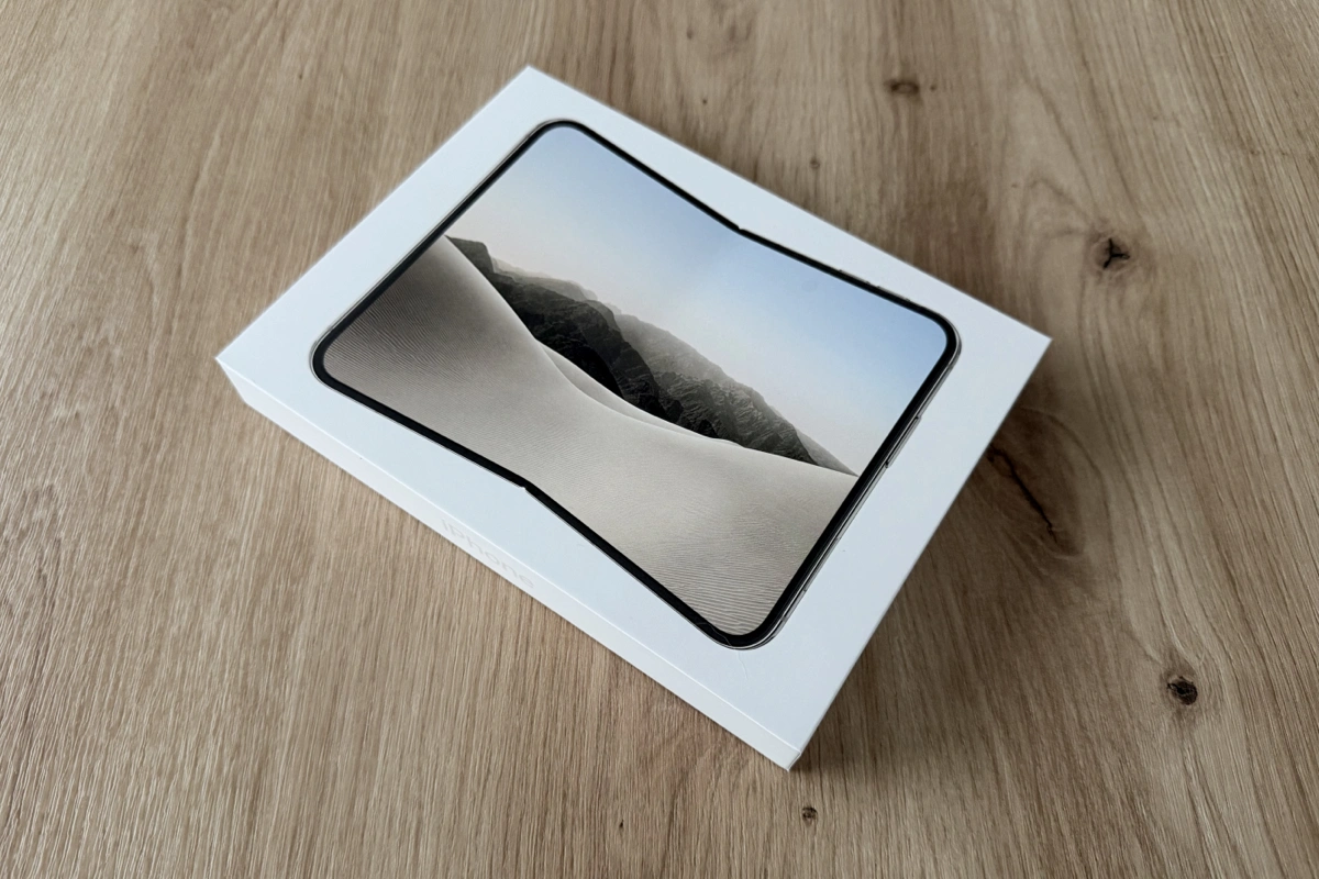
Unboxing it at home, the first thing I noticed was how well it sits in my hand when folded. I was a big fan of the iPhone mini for a long time, and the Duo is a good centimeter shorter still. The width feels just right, too.
The weight surprised me. On paper, the Duo is 254 grams, about 50 grams heavier than my previous iPhone 17 Pro. In my hand, though, I hardly notice the difference.
I couldn’t say much about the display at first because the iPhone was in the middle of a restore. But it opened easily, and the inner display came pretty close to the iPad mini. At that point, I didn’t know yet how much this display would blow me away.
The Display
Perfect segue. Because the display is what excites me most about the iPhone Duo.
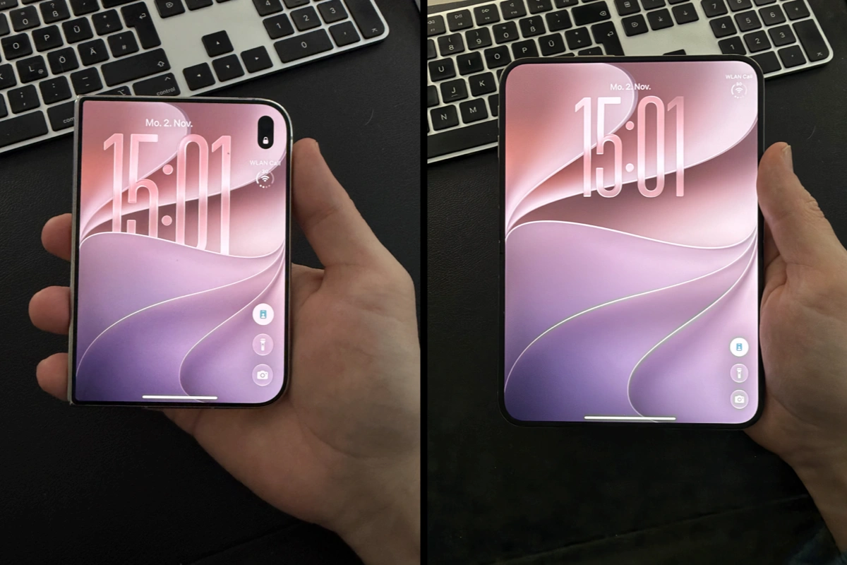
The outer display is just what you’re used to from previous iPhones, so I won’t go into much detail. What’s really amazing is the inner display.
At the store, the salesperson warned me: this isn’t a protective film you peel off, it’s the nano-texture layer, and it’s supposed to be there. Nano-texture has been an option on the iPad and MacBook for a few years now. Apart from a quick look at the Apple Store, though, I’d never really spent time with it.
Right after setup, I noticed how razor-sharp text looks on it. The matte display almost feels like an e-paper display, in a good way. Reading on it is a real pleasure, whether it’s articles, books, or messages. It looks almost printed. Comics and cartoon series come to life on it, too, and are incredibly enjoyable to read and watch.
In direct sunlight, content stays easy to read, and the display barely reflects. It’s like a small paperback that fits into any pants pocket when closed.
The inner display’s camera sits beneath the screen, so there’s no nano-texture in the round cutout above it. In bright sunlight, you can see the circle, but otherwise it doesn’t bother me.
The Battery
The Duo has two batteries, and they easily last all day, even with heavy use. That honestly amazed me, especially since I spend a lot of time on the large display.
With my last few iPhone Pro models, the battery would often be empty after half or three-quarters of a day of heavy use. Now I’m back to where I used to be: I charge it in the evening. Apple has struck a good balance here. The batteries are big enough for a normal day without making the device too heavy.
The Form Factor
This is the part that’s truly new. On the iPhone, it felt like 95 percent of all apps were portrait-only, and that has hardly changed over the years. With the iPhone 6 Plus, even the Home Screen could rotate to landscape. Hardly any apps followed, and by the time Face ID arrived, the landscape Home Screen was gone again.
The iPad, on the other hand, could do both from the start. Apart from the iPad mini, though, I’d say most iPads are used in landscape, especially with a keyboard attached.
With the iPhone Duo, it all depends on the use case. On the go, I naturally use the outer display a lot. Unfolded, though, I constantly catch myself switching between portrait and landscape, depending on what I’m doing.
What I’ve hardly used so far is, of all things, the mode Apple shows in most of its product images: the angled landscape orientation. Like an open book, with the keyboard split in half on the left and right. Held with two hands, it feels very comfortable. In everyday use, though, I simply haven’t had a reason for it yet.
I find laptop mode more exciting. When the Duo sits half-open on a table, iOS shows the keyboard on the bottom half and the rest of the interface above it in apps where you type. So far, very few apps make use of this. Most of the time, the content just wraps, and scrolling feels like it goes horizontal first and then vertical. That looks a bit off. But I’m sure plenty of new ideas will come up for this mode in particular. I’ve already experimented with it myself, for example with small mini-games or by using the bottom half as a trackpad.
Then there’s multitasking. With drag and drop between two apps, the Duo feels very much like an iPad, and it’s implemented really well.
What still takes some getting used to are the hardware buttons. Touch ID, the volume buttons, and the Camera Control are fixed to the frame, and with so many possible orientations, I have to stop for a second each time to figure out where everything is. The Action button is gone entirely. I expected that to be worse: with the flashlight as a control on the Lock Screen, I’m getting along just fine. Still, I hope the Action button makes a comeback at some point.
The User Interface
On the Duo, primary buttons, tab bars, and navigation elements move from the bottom edge to a sidebar on the right. It feels natural and coherent surprisingly quickly.
At the same time, there are now far more orientations than ever before. The outer display supports portrait and landscape, even though very few apps support landscape so far. The inner display has three states per orientation: fully unfolded, angled in book mode, and multitasking. I’m curious to see how creative apps in particular will use all of this.
From a developer’s perspective, it’s also a challenge. If you don’t stick to native standard components like modals, you’ll get yourself into trouble very quickly. The safe area of the new sidebar shouldn’t be underestimated either. There are a lot of edge cases to account for. Then again, they’re extremely interesting edge cases.
Apple laid a lot of the groundwork for this on the iPad. Ever since Stage Manager and freely resizable windows, iPad apps have had to handle arbitrary widths and heights anyway, and that’s paying off on the Duo now. Essentially, it’s iOS mixed with iPadOS, with the best of both worlds.
There’s also a lot to learn. It took me two days, for example, to figure out how multitasking works. Control Center now opens with a tap. And a gesture that’s been around since the very first iPhone still works: tapping the status bar scrolls all the way to the top. Even though the status bar now sits on the right, a tap on the top edge of the display still does the trick, say on a long webpage in Safari.
The Back button confused me at first. It’s now mostly on the right, but it points left. Until now, it always sat close to the action on iOS and iPadOS, matching the swipe-back gesture from the left edge. I understand the compromise: when reading, the content should take priority, not the button. Still, in the middle of something, it sometimes throws me off for a moment.
The Camera
The camera beneath the inner display has a fairly low resolution. That’s perfectly fine with me, because Apple came up with some clever solutions for it. When the device is unfolded, for example, there’s a mirror mode: it lets you use the main camera on the back while still seeing the preview. The photos come out in much higher resolution.
One thing I had to learn: look into the lens, not at the green dot. Until now, the green dot was always near the camera. Here, it’s on the display, while the actual lens is somewhere else entirely. Keep that in mind and you’ll avoid photos where you’re looking just past the camera.
The front camera on the outer display is solid. Placing it on the right side together with the Dynamic Island feels good and leaves more room for content.
What I do miss, though: the rear camera tops out at 2x optical zoom. My iPhone 17 Pro had 8x, and I loved it because you could take great photos even from a distance. Compared to that, 2x is a step back. I’d have hoped for at least 4x. That there are only two lenses and no LiDAR doesn’t bother me, on the other hand. That can stay exclusive to the iPhone Pro.
The camera plateau on the back is something I hope gets refined. It doesn’t span the full width and only covers the lenses, the flash, and the microphone. Without a case, the Duo wobbles quite a bit when it’s lying on a table and I’m writing with the Pencil. All current iPads share the same issue. With the last iPhone Pro, Apple had already solved this nicely with a full-width plateau. I’d love to see that here in a future generation, too.
The Apple Pencil
The Duo is the first iPhone with Pencil support. I think it’s a good time to move past Steve Jobs’ famous “Who wants a stylus?” Especially if you’re coming from the iPad, there are use cases where there’s no way around the Pencil: illustrating, drawing, or simply taking handwritten notes. This post actually started out exactly that way.
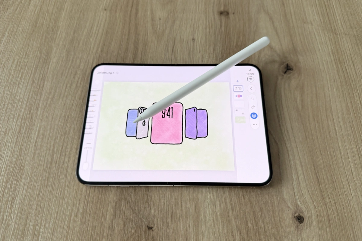
I’ll admit, Pencil support was a big reason I bought it. I’ve never used it on the small outer display, but on the inner display it’s great. Thanks to its matte surface, the nano-texture glass has a certain feel to it. At times, it’s almost like writing on paper with a real pen. I didn’t expect that at all. It feels much more natural than smooth glass.
As for the Pencil itself, I still see room for improvement. With the Apple Pencil (USB-C), I can’t double-tap to switch to the eraser like I’m used to from earlier generations, because it doesn’t support any gestures. I do miss that day to day, and I’d be happy if a future version could at least switch between two tools.
Even better would be a slightly shorter Pencil that charges inductively, say on the hinge. Then I could carry both in my pants pocket. As it is, the Pencil is longer than the folded iPhone is tall, so I always have to stash it somewhere separately.
Conclusion
I’m genuinely thrilled. The Duo is a whole new user experience, a bit like when the iPad first came out, or the first iPhones before that. In recent years, there were understandably only small changes from one generation to the next. Here, that certain magic is back.
Over the years, there were plenty of moments when I missed my iPad mini. In the doctor’s waiting room or out and about, when a slightly larger display would have been nice. Those moments are gone now.
That said, you should honestly ask yourself beforehand whether you have those kinds of use cases. Only then does the Duo make sense. As a phone just for casual use, I’m not sure it’s the right device. But if you know exactly that gap between iPhone and iPad, you get a really well-made blend of both.
What I’m looking forward to most is seeing what developers do with it in the coming months. I’m already working on a few ideas myself, and experimenting with them is a lot of fun right now. More on that soon.